Info Visualization | Evan Cohen
Appearance Displays
Model #1 Emulation
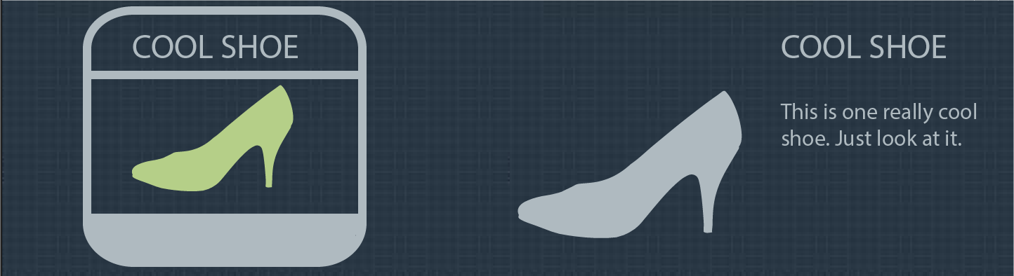
I looked at the preexisting images in this infographic and emulated the simplistic rounded solid colors and surrounding lines/text to replicate their appearance.
Critique 1
Well emulated graphics! I'm a little confused about the box around the graphic on the left, why is it there? What is it's purpose?
You should move the text to the left of the shoe for the second graphic to concerve space, and the space between "Cool Shoe" and "this is..." is too large (although upon a second glance it's fine).
You might consider using some opacity in either of the graphics.
The one on the right is better because of it's simplicity and openness.
Changes made baised on critique: Moved the text to the left of the shoe for the second representation. Marginally decreased the space between lines of text.
Critique 2
I see two cool high healed shoes, one hospital green and the other a grey silluette.
Each graphic has the same profile, but different colors, text positioning, and alignment (integrated vs. seperated text)
I like the larger size of the grey graphic, but the color of the graphic on the left. The larger size makes it more apperent of what it actually is.
Changes made baised on critique: Increased the size of the graphic on the left.
Critique 3
I see a shoe! The simplicity is nice, but what are you trying to show? The graphic on the right has more text, and therefore more info, which I like.
The color scheme is good, and the right contrasts with the background better.
The border on the left could be a thinner stroke, rite now it draws attention to the border rather than the graphic itself.
Overall the one on the left is better.
Changes made baised on critique: Decreased the stroke size for the left graphic and added more text.
Model #1 Emulation - Revised
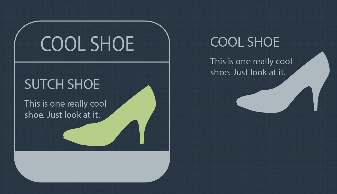
The actual emulation I am going with is on the left (I chose to include the other because there were very minimal modification made). I increased the size of the shoe in order to make it more distinguishable, and also moved it to the right in order to make more space for text. The last thing that I did was to tile the background that I pulled from the original graphic, because it was getting blurry. I think I did well integrating the feedback that I recieved and am very happy with this result.
Critique 1
No text inside box. Left one is too crowded. Invading the shoes space. Prefer left. Older model. simpler. centered. less cluttered. Similar ammounts of text. Before the left shoe had less text.
Changes made baised on critique:
Critique 2
Color model - nailed it. good Integrated text, good weight on outlign Left is better. Compatmentalized is organised/pulled together "Sutch" => such
Changes made baised on critique:
Critique 2
Grouping of text around shoe is better on left Lign wieght is a lot better. Base is TOO FAT. Text is too close to the shoe. go away text. Colors are good. A lot better than the first ones. Background is "graphines"??? <- cool Capital letter in title is good.
Changes made baised on critique:
Model #2 Emulation
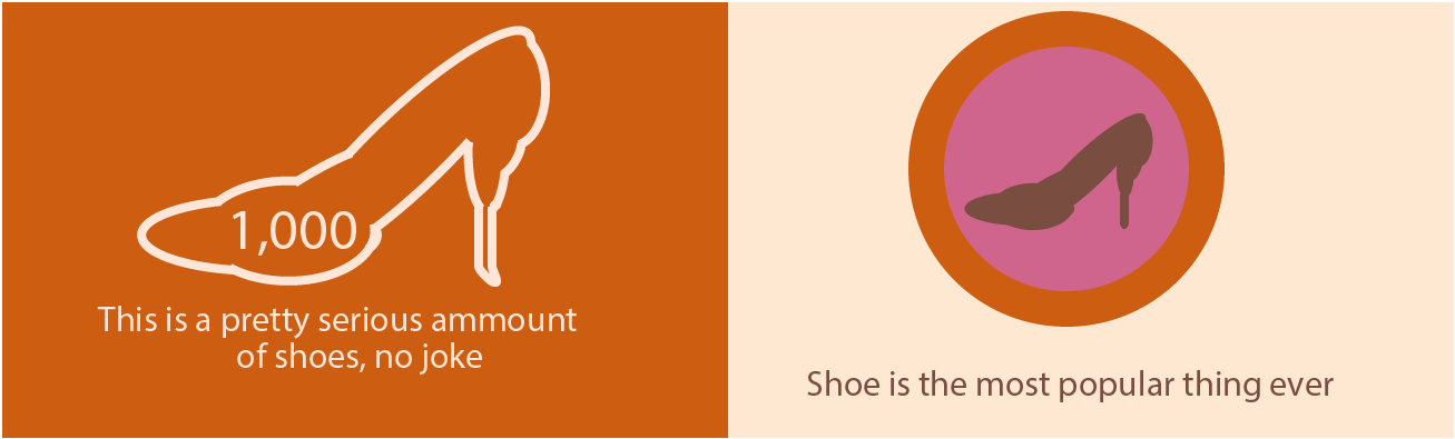
I looked at the preexisting images in this infographic and emulated the simplistic rounded solid colors and surrounding lines/text to replicate their appearance.
Model #3 Emulation
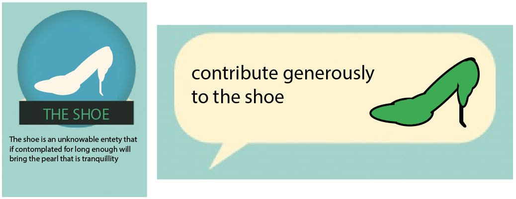
I looked at the preexisting images in this infographic and emulated the simplistic rounded solid colors and surrounding lines/text to replicate their appearance.
Final Appearance Emulation
For my final infographic I chose to use the fontset that GitHub uses for their icons called Ocitons. This lets me make clear associations between GitHub actions and my data.