Info Visualization | Evan Cohen
Location Display
View Data Source
Number of Commits ber 100K People
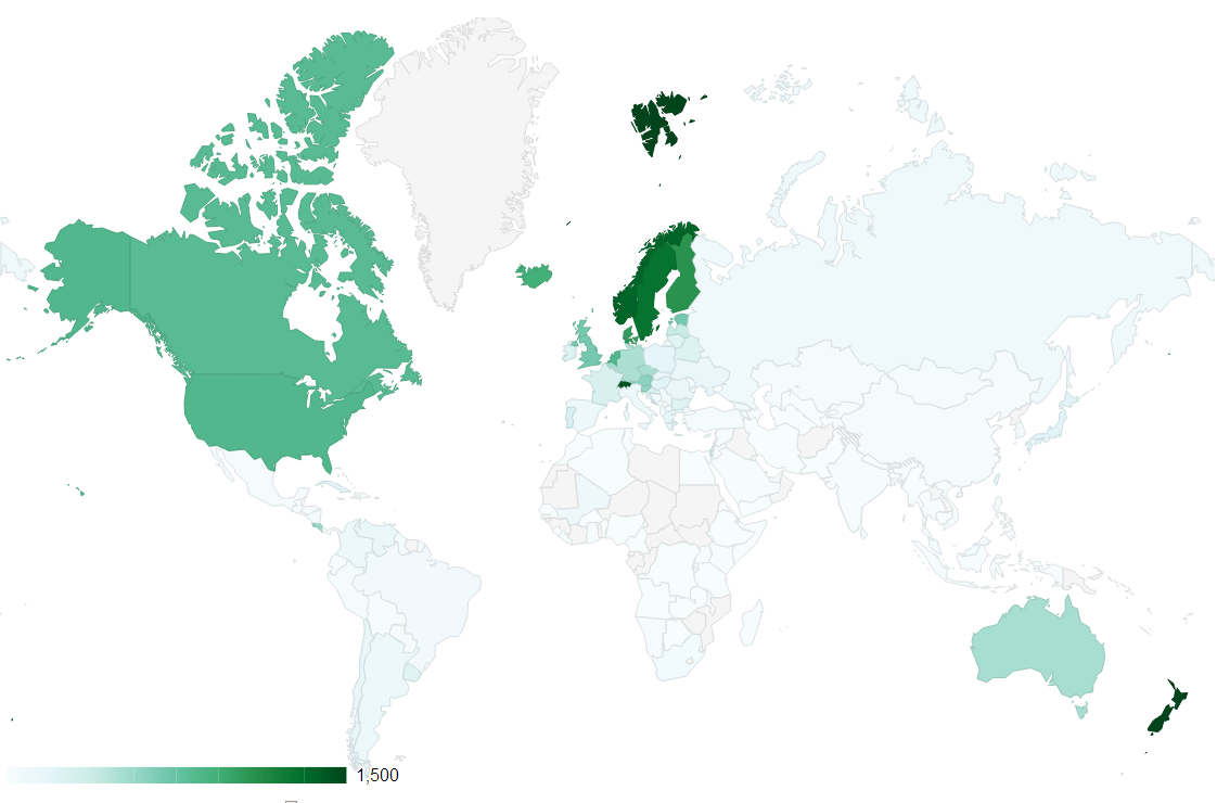
This location display provides a visualization of commit density, in this case the ratio between commits and total population/country.
Total Number of Commits
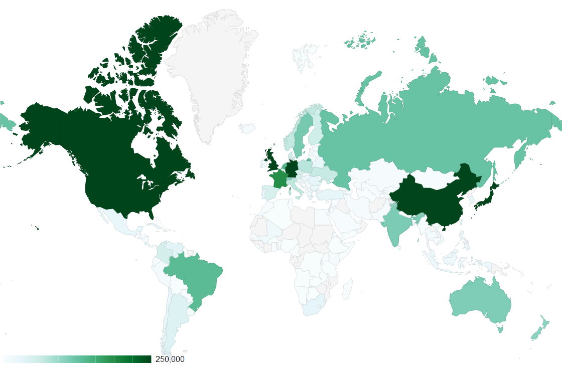
This location display also provides a visualization of commit density, but in this case it is the total number of commits (Countries with larger populations will enharently have more commits).
Critique
Critique 1
This looks like a really cool display! I don't like how the colors get so washed out. I can't tell where people are committing in the bottom quarter of the data.
Changes made baised on critique: Changed the color scheme to match.
Critique 2
I think these are way too small, they need to be much bigger. I like that you have a key, but I can't really pick out the countries that commit less, they all just look white.
Changes made baised on critique: Increased size of graphic and changed colors. Merged into 1 interactive display so it takes up less space.
Critique 3
I can't quite figure out what I'm looking at... Maybe you should add a key or some sort of description. I like where this display is going!
Changes made baised on critique: Added text description.
Revised

I merged the two location displays into one interactive display. I also chose a different color scheme that makes things more distinguishable.
Critique
Critique 1
Why is this interactive? I don't need more colors. Just leave it at default and dont let them change it. Regions are cool! Population should somehow be tied more cleverly to total. May only want to have commits per 100k. Why would I want to change the data range.
Changes made baised on critique: Moved the text to the left of the shoe for the second representation. Marginally decreased the space between lines of text.
Critique 2
Maybe experament with the colors a little more to find something that will match your color model.
This is pretty cool. I like that I can mouse over the elements and see the exact numbers. I don't like how the slider works, it seems pretty useless.
Changes made baised on critique: Considered removing the slider, but made it useful instead by changeing the way max values are calculated.
Critique 3
I really like that I can change the colors, the region, and the data display. This is much better than your last color scheme, but still doesn't emulate your color model
Changes made baised on critique: Updated colors to emulate model.