Info Visualization | Evan Cohen
Numbers Emulation
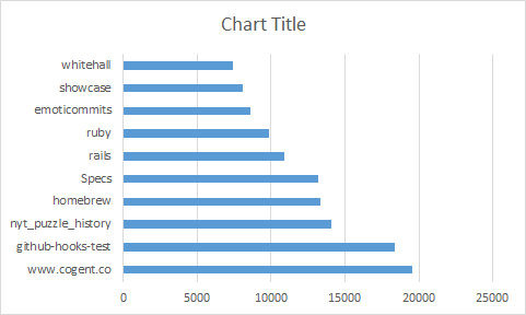
Excell
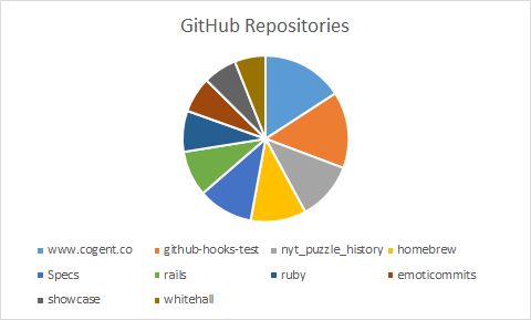
Revised
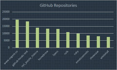
Revised Again
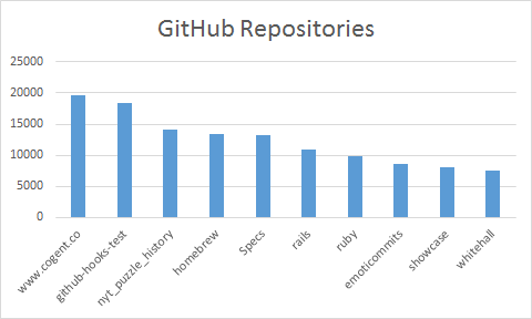
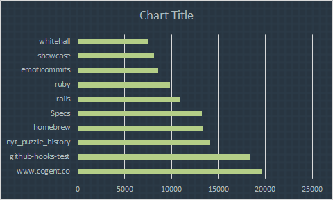
Another Numbers Display
I made some pretty significant changes based on the feedback that I recieved from my peers in terms of my number display. First off, I wasn't emulating my model enough, so I added dashes and fixed some more colors. I also made the names easier to read (human readable vs repository name). I also changed the data source to be something a little more meaninngful in terms of what it reperesents. I emulated my text model by using a tall font for the title, and smaller skinny font for the names and numbers. I played around with using some cursive, but that didn't fit very well.
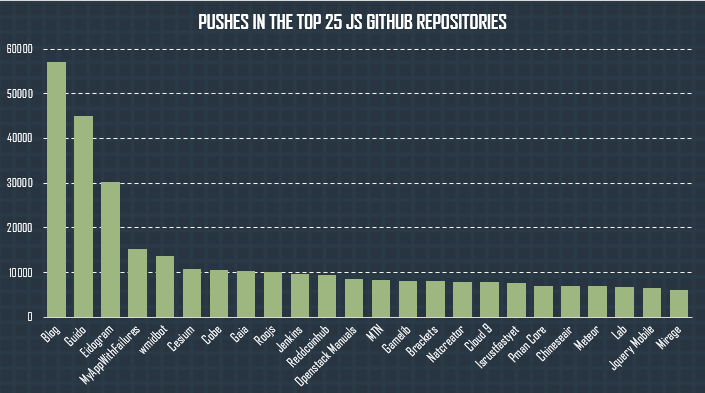
Critique 1
I see data from 2005 to 2012, the axis list 3 months from each year. I'm not sure why there is -3000? I like how the data is stacked. You should fix the font to emulate your text model. Why is the data not sequential? Nice colors.
Changes made baised on critique:
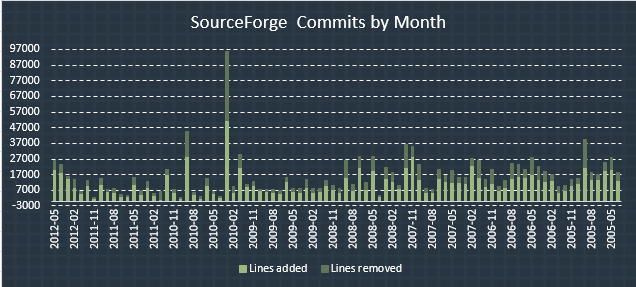
Critique 2
You matched the color model well. I like the rotated labes even though they don't conform to the base model. You may want to not use a grid as a background. That's a lot of data, I'm not sure what I'm supposed to be seeing. The colors are spot on. You should match your font to that of the first model. It works really well overall.
Changes made baised on critique:
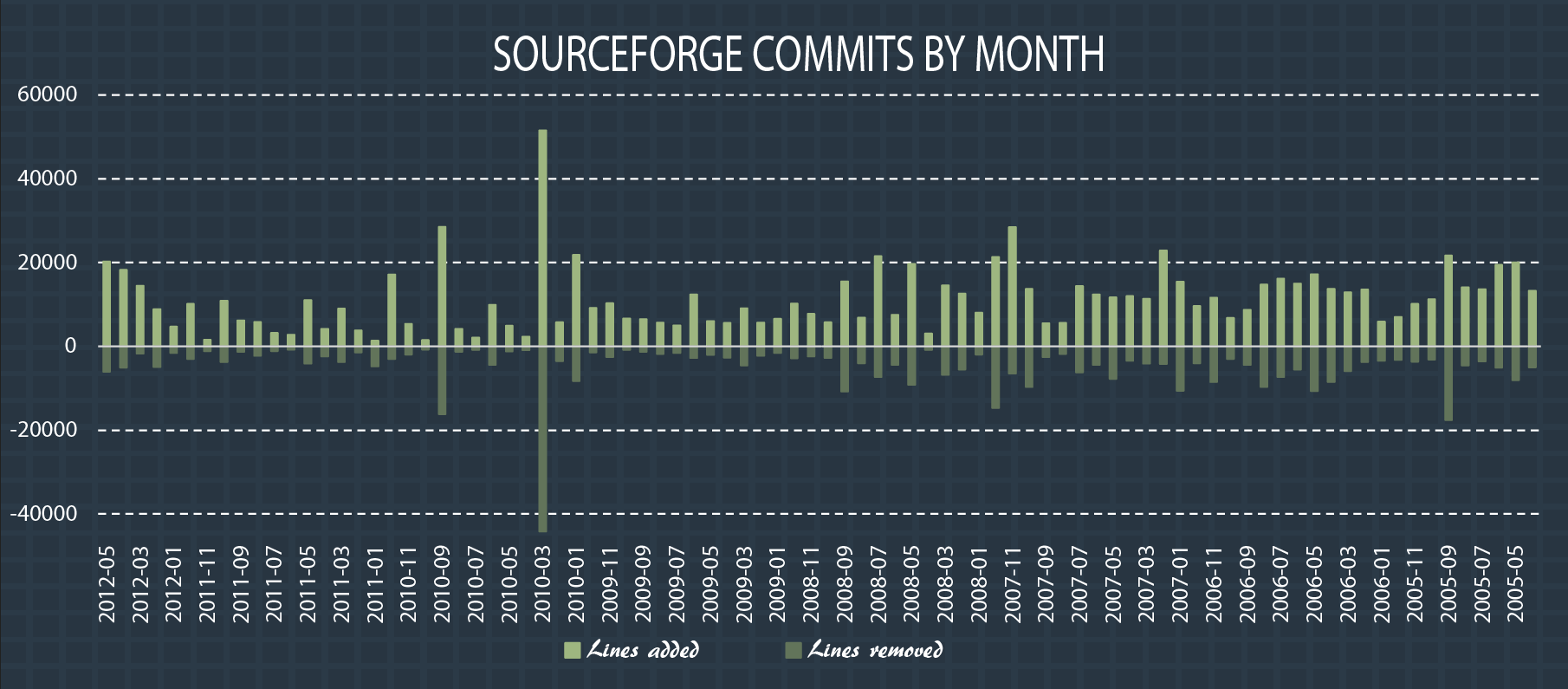
Critique 2
The dashed lines look awesome, they are not too distracting to overwhelm the data. Way more data than your previous graphs, so I can see better patterns and trends. The lines added/removed are stacked and that's a little confusing. The slanted text makes it easier to read but makes the positioning kinda weird, you should try using horizontal. The background grid is very subtle, and keeps things interesting.
Changes made baised on critique:
Numbers Revision 3
Critique 5-6-14 1
Numbers Lines added and lines removed, pretty clearly coding. Color scheme. Cursive key is not a great idea. Maybe the title? Very legible, shows a great relationship between values. X-axis is a little crowded.
Critique 2
Numbers Like the cursive font. Stacking values. Good emulation (dashed lines, colors). X-axis is confusing, make it more space. Actually spell out the dates instead of using numbers.
Critique 2
Numbers It's so cool how it goes under. Oh gosh. Increase the size and placement of key (under the title). The cursive font is weird. Oldest should go first (like a timeline)! The background and dashed axes are fantastic. Identical emulation.
Final Infographic
Countries with the most GitHub users
- United States 20.3%
- Germany 7.7%
- China 5.8%
- UK 4.8%
- India 4.3%
For my final infographic I chose to start from scratch. This is because I did not want to have a repository specific numbers display, and needed something to accompany my location model to make a little more sence of things.
I retained the positive aspects of my other number models to create this final model so my previous feedback was actually quite helpful.