Models - Info Visualization
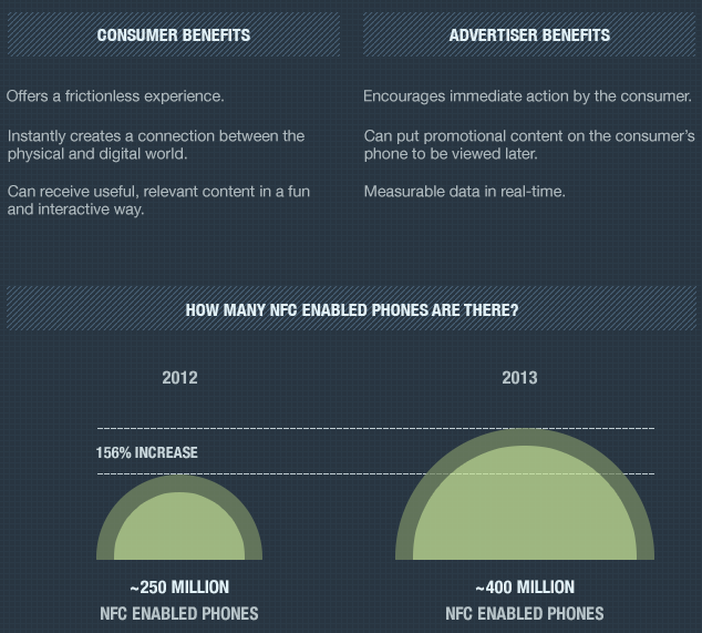
Color Model

I chose this color model because it has a very clean color contrast. While it is slightly limiting in therms of what I can do with color, the sleek profesional vibe is defenetly worth the lack of many colors.
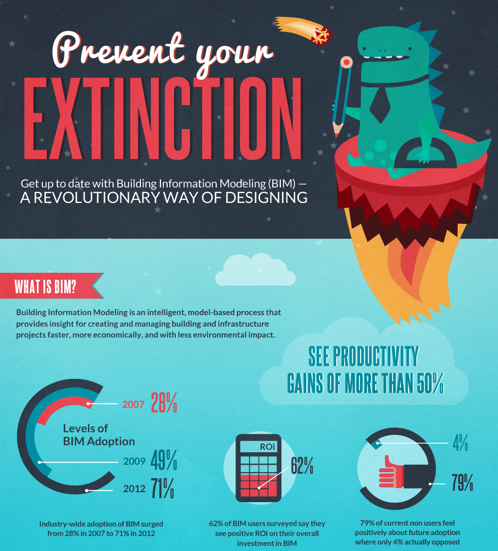
Text Model

I chose this text model because I like the contrasting fonts and colors. I feel that they will match well with my topic. The tall blocky texy is both new-age and fun. I'm am not yet sure if this will become my base model.
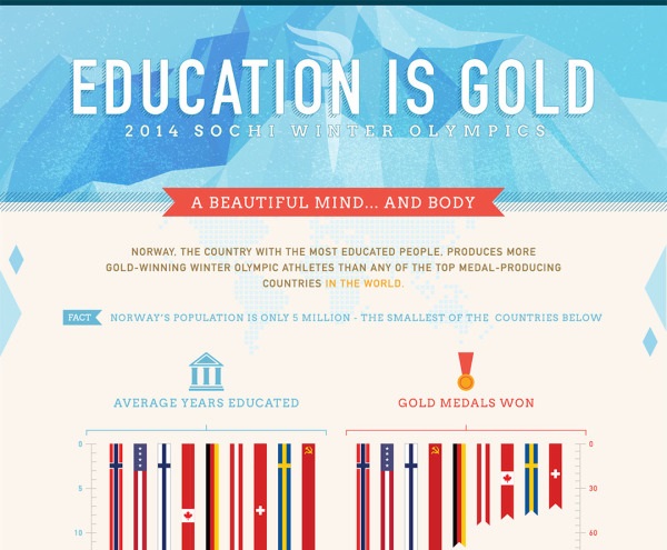
Layout Model

Becaue I'm using d3.js for my final project, and my final infographic will be on a web page, so I am restricted to a relitivly vertical layout. While it may seem plain, I think a vertical layout will provide a clear sence of order, which will allow me to explore a narative within my final infographic.