Info Visualization | Evan Cohen
Time Displays
Punchcard
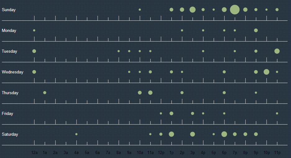
This desplay shows on what days and time commits usually fall on. It gives a general feel of what time of day people commit the most (and therefore gives a sence of what times of day they are most productive.
Code Frequency
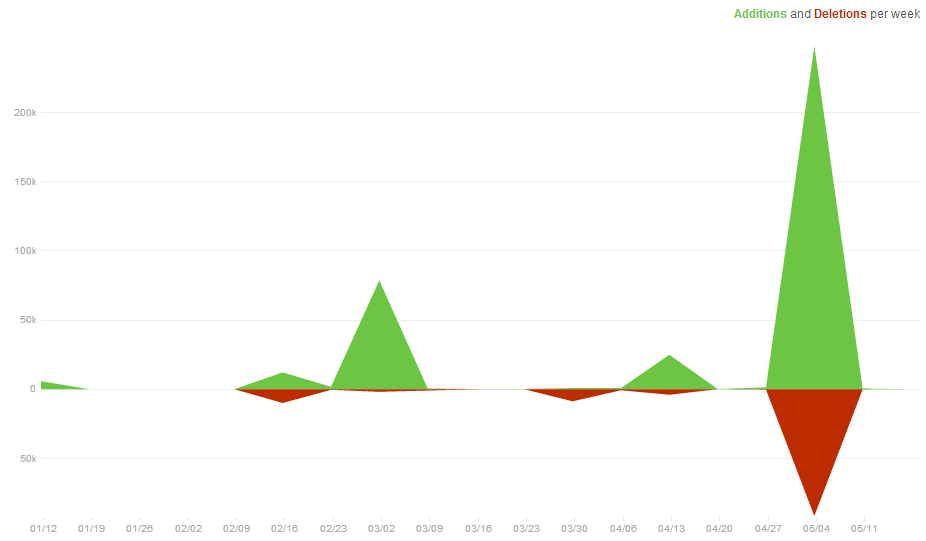
This display shows code contribution frequency over time. I used something similar to this for another display, which a stacked bar chart. This is very similar, but uses lines instead. It also uses green and red to indicate the addition and deletion of lines. I may end up chaning it to reflect my previous display (with two shades of green).
Critique 1
Size works, the bubbles make it easy to see density. Very effective display. Color model matches well. Make sure that in the final layout the text is big enough! You should make the X-axis not black.
Changes made baised on critique: Subtaly increased axis font size. Made X-axis white.
Critique 2
Create a key (for commits). Maybe the time could be done differently (different X-axis). The height of the arms is strange, why are they different? Are there better ways to represent this data? Fix the color of the X-axis.
Changes made baised on critique: Created a side-bar with text to describe this infographic to insure clarity.
Critique 3
Super cool! Pretty simple, should have a title. So cool. The tick marks are a little strange. Can you remove them or do something else. The small bubbles get lost. You should fix the color of the X-axis.
Changes made baised on critique: Experamented with tic-marks, made them all uniform height.
Revision

Critique 1
I expected it to be total users ever, but I adjusted quickly. I like how easy it is to understand. Maybe change the axis so it is only every couple hours so it is less crowded. Very cohisive. Emupates the color model well.
Changes made baised on critique: Moved the text to the left of the shoe for the second representation. Marginally decreased the space between lines of text.
Critique 2
That's Crazy. The hover numbers are cool, maybe you could have the numbers on the side when you hover, kind of like the map. 'Wednesday' is touching the axis, maybe add a little more space.
Each graphic has the same profile (Refurring to contribution frequency), but different colors, text positioning, and alignment (integrated vs. seperated text)
I like the larger size of the grey graphic, but the color of the graphic on the left (above). The larger size makes it more apperent of what it actually is.
Changes made baised on critique: Increased gutter width so Wednesday is no longer bumping into the line.
Critique 3
Why is the X-axis black? I don't like the position of the days of the week on the Y-Axis. The X-axis is a little crowded. Other than that it looks pretty good.
I like the one on the left way more than the code frequency, that's the one that you should use. It gives a more comprehensive overview and is much more visual.
Changes made baised on critique: Repositioned days of the week. Only showing AM and PM on the 12th hour to free up space on the X-Axis
Final Time Model
When Do People Use Github
Punchcard
The graph on the left shows when people commit. Use the text box below to look at different repositories.