Info Visualization | Evan Cohen
Revised Again
Layout 1
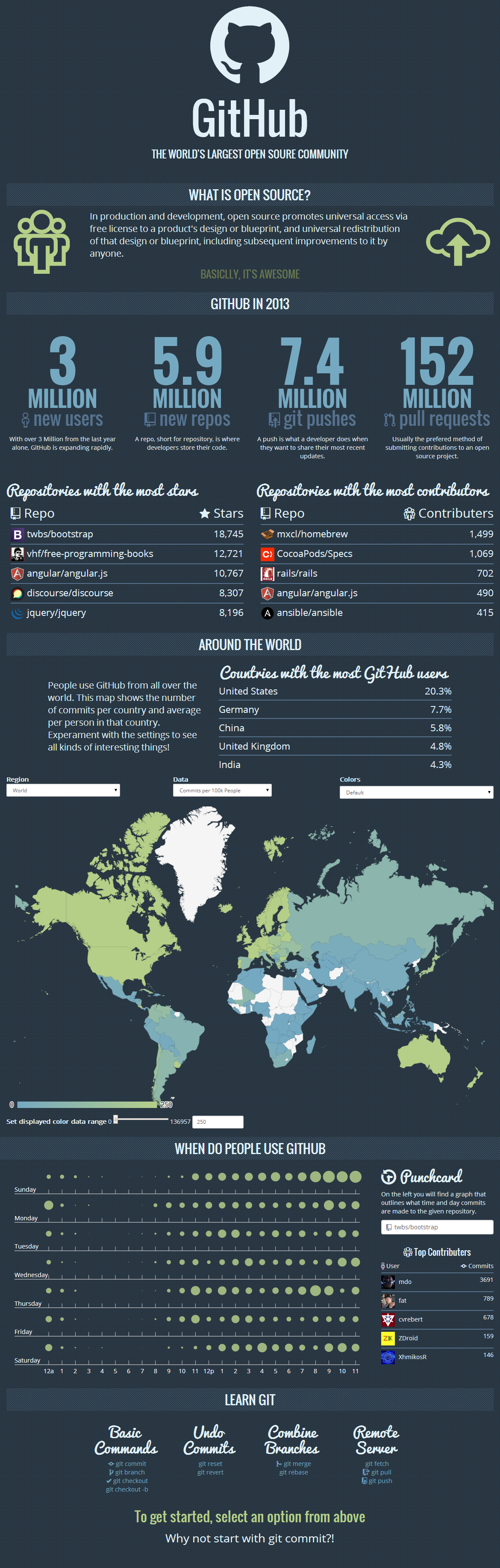
This layout best emulates my model, everything is kept strictly vertical with rows of content. This is effective because content will ultimatly be displayed on a webpage. People read websites from top to bottom, and this layout reflects that the best of the two.
Layout 2
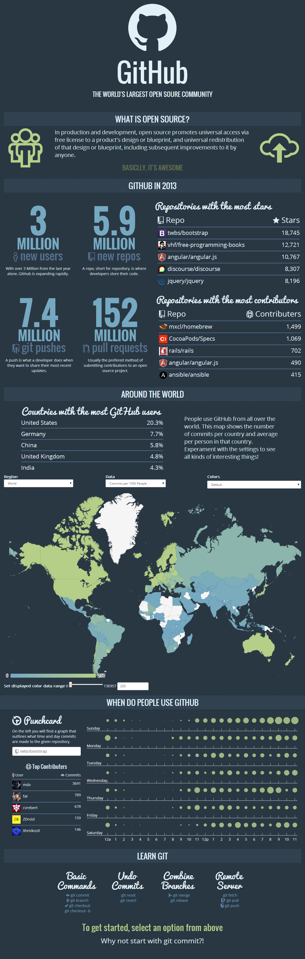
I decided to deviate slightly from my layout model and group content rather than stacking it. This is less effective overall, but provides an opertunity of explore alternatives.
Critique 1
I like how liniar it is on the first one. It makes reading it easier. The second one with the punchcard on the left makes it easier to understand that I am supposed to interact with it. That said, it looks better visually on the right... The top one is better overall and has better flow.
Changes made baised on critique: Decided to uese the first model. Put the punchcard on the left.
Critique 2
The top layout better emulates your layout model, but I do like the positioning of the numbers in a block. It gives a bit more space for the graphs and things feel more grouped.
The punchcard is better on the left.
Changes made baised on critique: Kept the punchcard on the left and the key on the right.
Critique 3
These look really great! I like the first one becaue things flow better. When I scroll down each new row is different content, and it's a better way of seperating content for your data in particular.
Changes made baised on critique: Chose a more vertical layout.